Securonix
—
Dec 2023 - January 2024 - 2 months
Reducing time on task within a Policy Creator
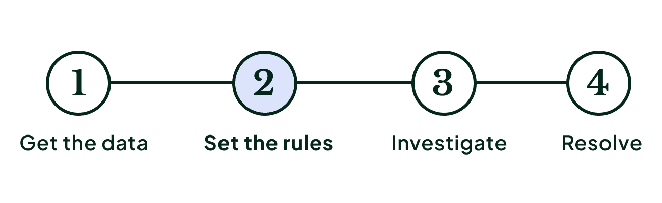
Setting the rules of the game
Skills/Methods
Product Designer
Interaction Design
Prototyping
User Research and Testing
Facilitator
Team
Lead Designer (Me)
Junior Designer
Product Manager
Developers
STACK
Figma
Figjam
Useberry
Zoom
Atlassian Suite
What you need to know
Policy Creation is a critical component that allows security teams to define the conditions under which an alert should be generated.
By setting up policies, security teams can specify what constitutes normal behavior and what should be considered suspicious or indicative of a security threat
How can we reduce our user's time spent in the policy creation so they can focus on catching the bad guys?
How can we reduce our spending in support and training?
The brief
As policy creation grew in complexity, so did the hurdles to maintain it resulting in customer complaints and business costs increase. My task was to simplify the workflow, leading to significant savings in support costs and enhancing customer satisfaction and retention.
Constrains
To make a meaningful impact, we set initial design phase guardrails, intentionally leaving a section mostly out of scope.
Challenges
Business Challenges
Customers spent too much time on the policy creation setup.
High resources were allocated to support, training, and maintenance, increasing costs.
Enhancing customer satisfaction was crucial to remain competitive.
Design Team Challenges
Building trust and influence in an engineering-led organization.
Implementing the largest design system overhaul.
How I tackle the redesign
Lacking familiarity with the policy builder, I engaged deeply with the product, starting with an overview from our PM and diving into the limited documentation available.
Approach
Mapped the current user experience, noting questions and uncertainties for discussion with stakeholders and users.
Conducted user interviews and surveys with both expert and novice users
Identified Jobs To Be Done (JTBD), established design principles, and refined the project scope.


Understanding and identifying gaps by mapping the flow.
Propose new flow with improvements and simplification. Call out questions.
A/B test some of the different approaches. User interviews.
Findings
Not everyone is an expert
Significant knowledge gaps and skill degrees existed among security analysts.
Confusing even for power users
Stakeholders, internal users, and customers found policy creation confusing, especially condition setting.
Inconsistency everywhere
Inconsistent terminology and design patterns led to a disjointed user experience, making creating and understanding a policy search long and difficult
Design Exploration
With new insights, we conceptualized a new workflow aligned with our design principles.
This involved broad design exploration and iterative sessions with users and stakeholders.
The strategy involved exploring various solutions, testing different approaches with users, retaining effective elements, and then synthesizing them into an improved solution.
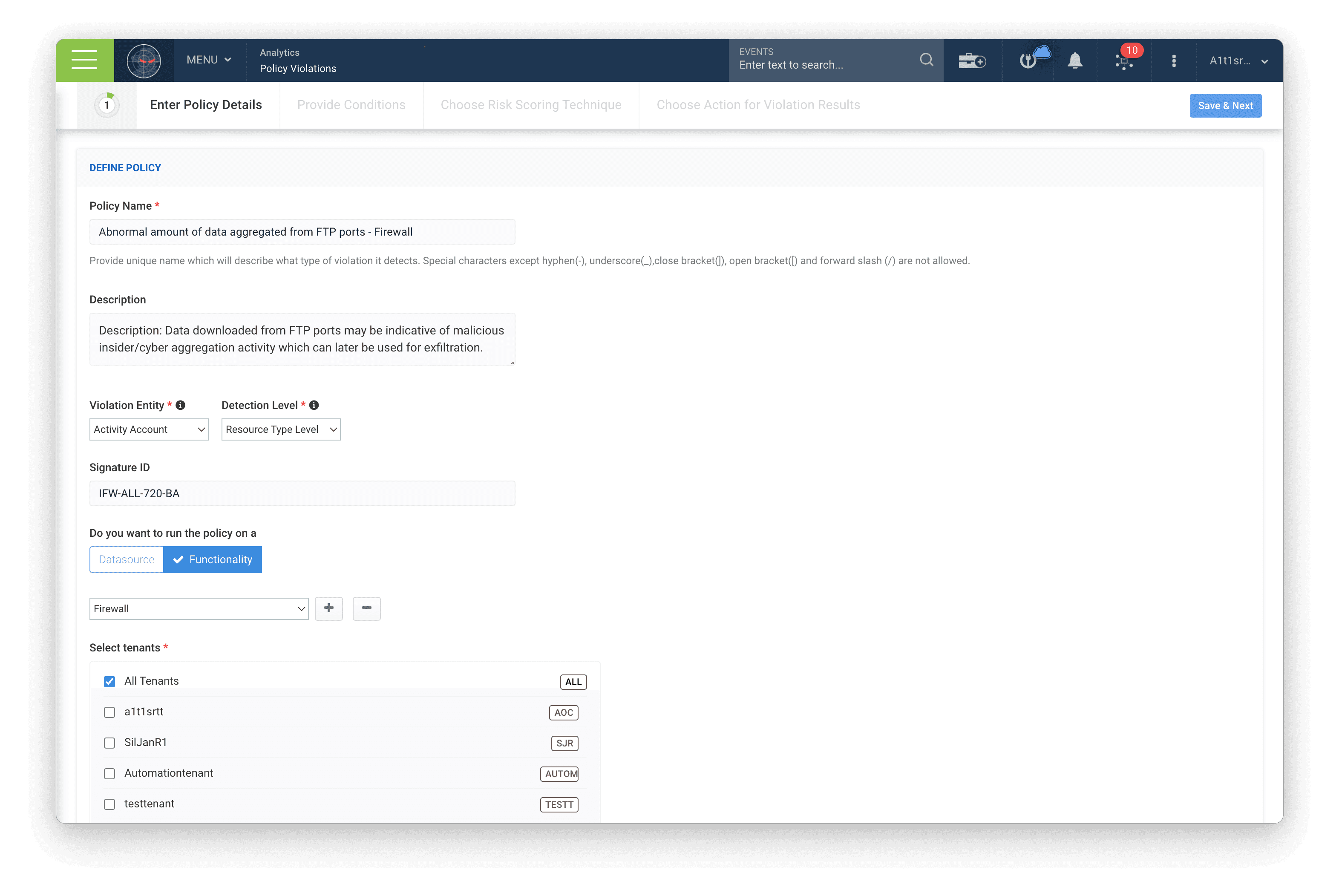
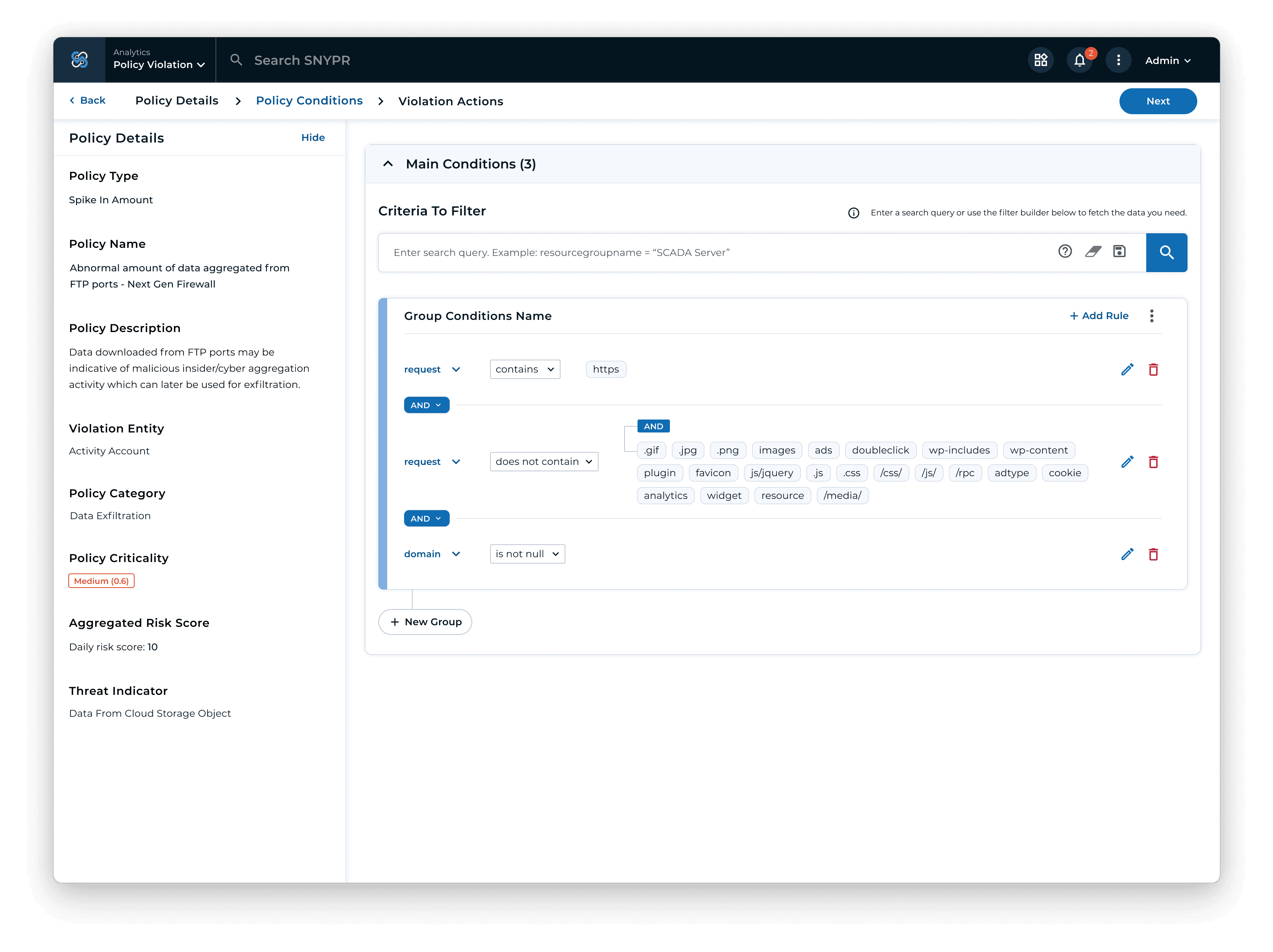
Details Page
Original Design
Cognitive load and no context: The original design pain points revolve in user's not knowing what policy type to select, as well as loosing the policy details info in context for the next steps.
Redesign A
Better decisions: A more direct approach to fill the policy details merged the page with the conditions. Keeping in context the policy details when creating conditions.
Redesign B
Provide a choice: A dedicated details page allowed to display information and examples of the policy details for all expertise levels, allowing to focus filling in the details without distractions.
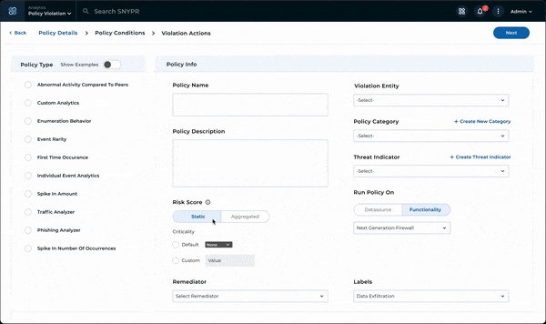
The original design pain points revolve in user's not knowing what policy type to select, as well as loosing the policy details info in context for the next steps. I addressed these shortcomings by:
Adapting the interface to cater to both novice and experienced users, by providing definition and examples giving them a choice regardless of their expertise level.
Maintaining detailed information on display to enhance context when creating conditions. This approach significantly reduces the time required to complete tasks and diminishes the dependency on customer support.
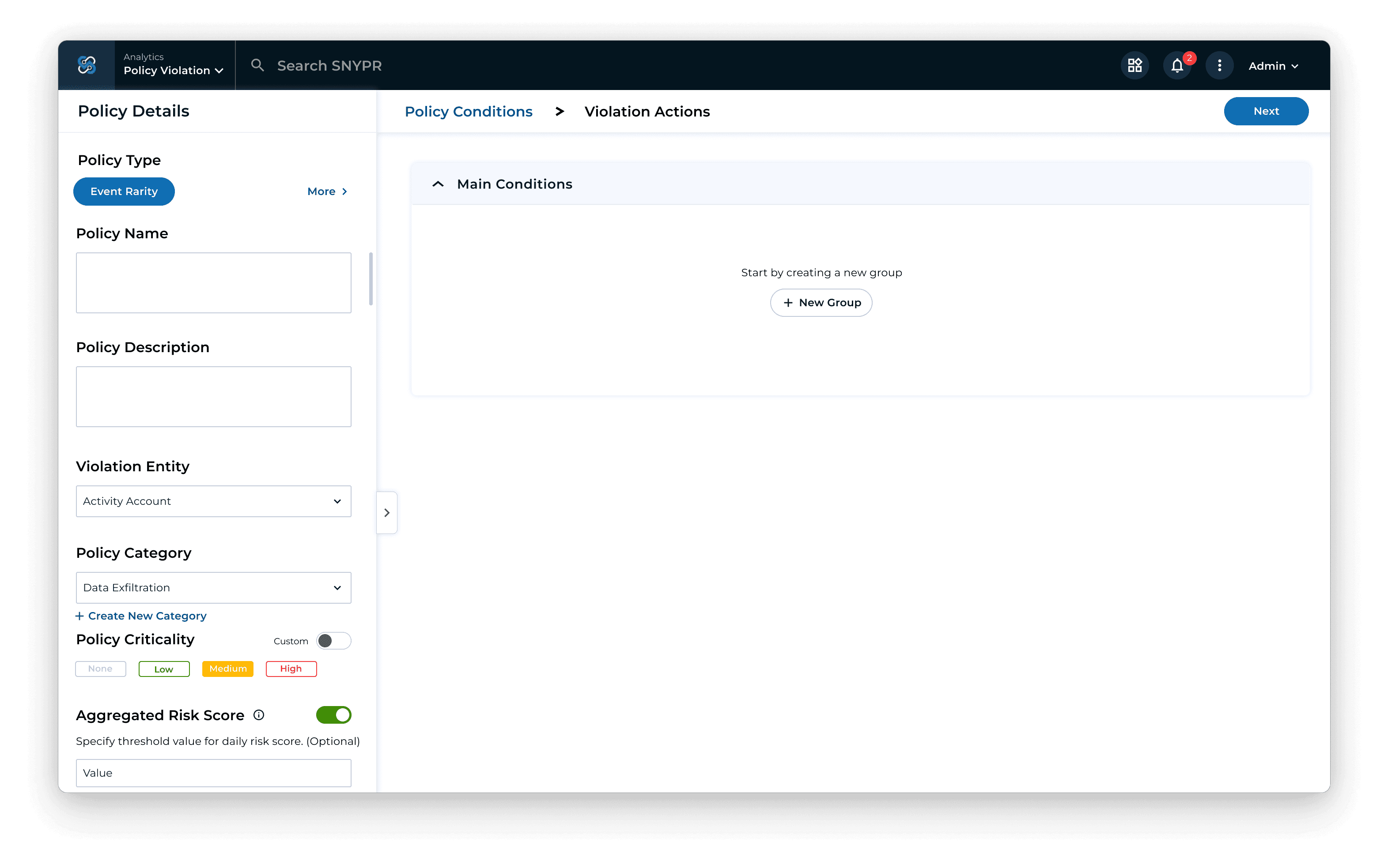
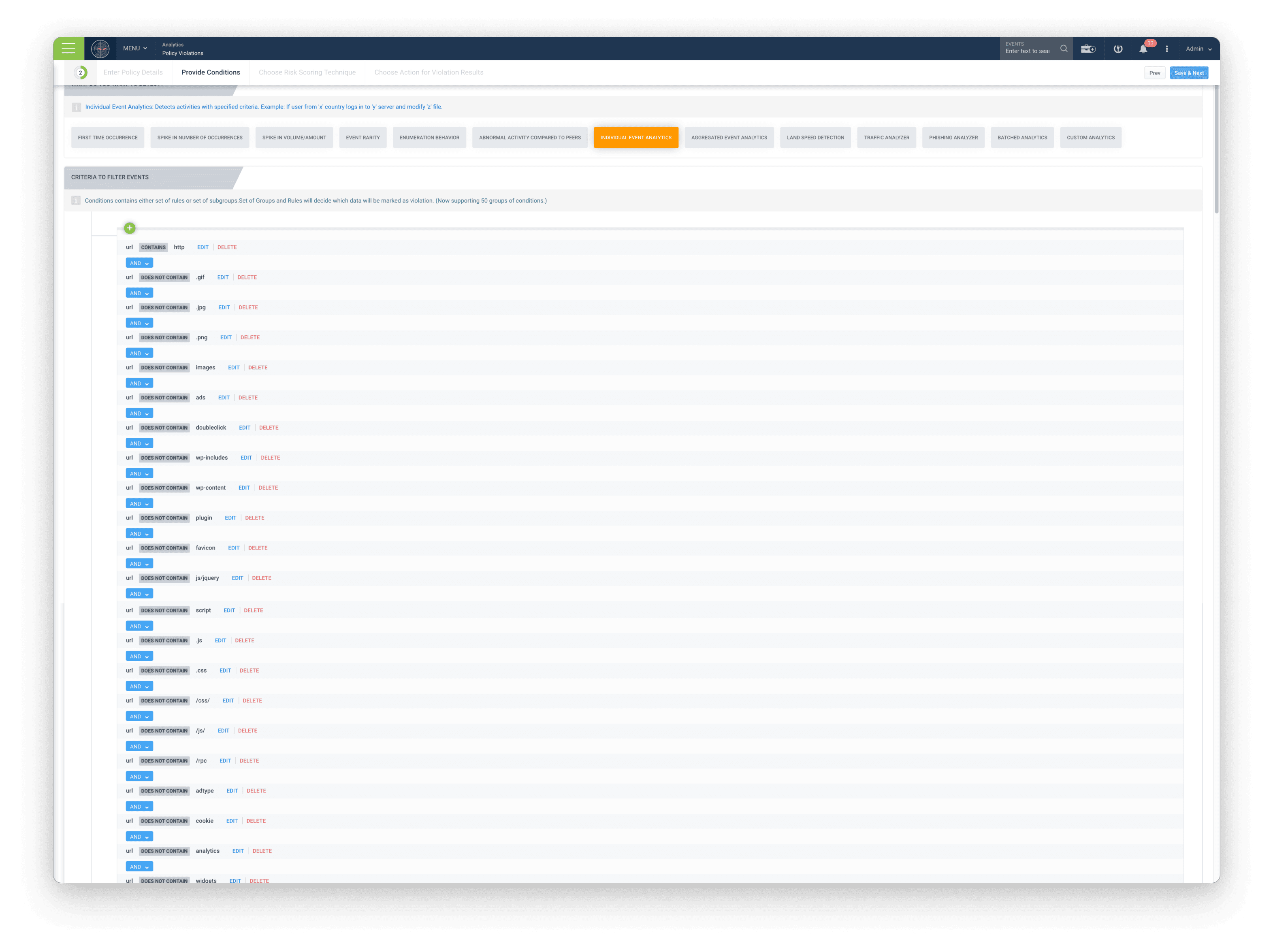
Original Design
Task redundancy and unintelligible policies: This approach required a lot of repetitive task creation and made it hard to read and understand what the policy actually does, resulting in users bouncing off the page or asking for support.
Redesign A
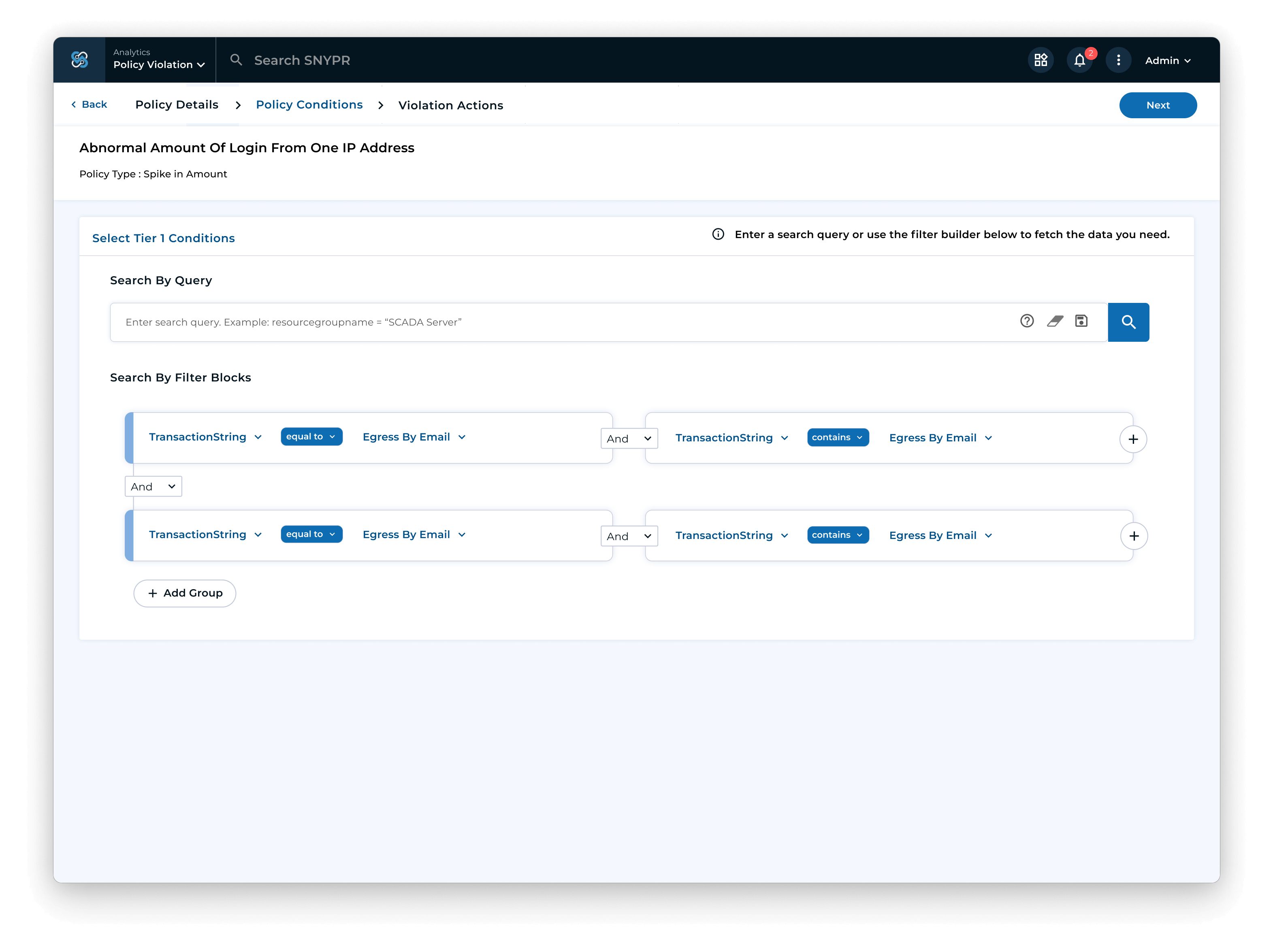
Grouping Conditions and Contextual Search: Improve the readability and add the ability to create groups to better organize the conditions. Added a search query to provide more context.
Redesign B
Multi-Value Inputs and Enhanced Context: Enhanced the policy creation wizard by integrating policy details throughout to maintain context and introduced the ability to add multiple values simultaneously, improving both task efficiency and legibility.
Original Design Issues: Task redundancy and unclear policies led to user frustration and increased support queries.
Redesign A: Introduced condition grouping and contextual search to improve readability and organization.
Redesign B: Upgraded the policy wizard with persistent policy details and multi-value input for better context and efficiency.
Redesign B took the improvements from the first redesign and expand on them. Showed the best results in user testing.
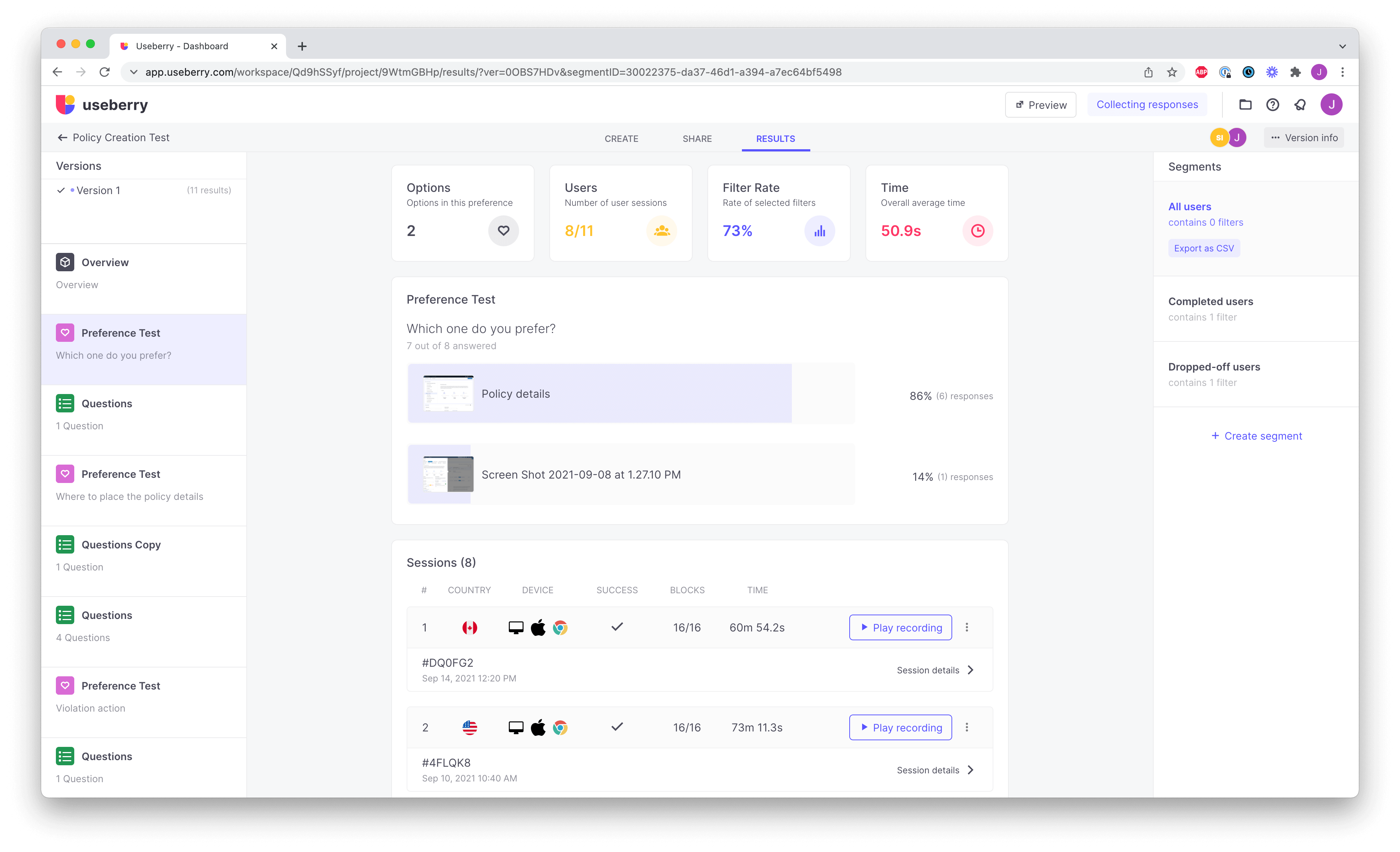
Policy Overview: Quick Access Meets Clarity
How analysts find and understand policies
When I dug into our main JTBD, I found out that analysts often revisit the page to get the gist of what a policy is all about. So, we set our sights on making it quicker and easier to not only find the right policy but also to understand what it's for.
Original Design
The original system's cumbersome filtering made finding a policy tedious and understanding it required navigating the entire policy creation flow, adding to the frustration. This resulted in a time-consuming experience.


Redesign
The redesigned interface simplifies policy management with easy-to-use table filters for sorting and searching. Quick policy overviews now provide immediate insights and facilitate efficient editing and comparison.
User-Centric Focus: Recognizing that analysts frequently revisit the platform for policy clarity, the redesign prioritizes ease of finding and understanding policies.
Streamlined Navigation: The original design's cumbersome filtering and policy creation were overhauled to offer a smoother, more intuitive navigation experience.
Efficiency Enhancements: Introduction of quick policy overviews and improved filtering capabilities significantly speeds up policy comparison and editing tasks.
Business Impact
The redesign, featuring a dedicated details page, improved conditions flow, and policy overview streamlined the user experience and improved operational efficiency, significantly reducing policy creation time by 36% and allowing security teams to focus on identifying threats. This simplification also led to substantial savings in support and training costs by 23%, positively impacting the bottom line.
" This is genius, I don't even need the documentation anymore. " - Cybersecurity Analyst