As the sole product designer, I solved the key usability issues and revamped the visual style by re-imagining what it’s like for analysts to search queries. The new design reduced time on task, improve bounce and conversion rates, and improved users’ satisfaction.
Setting the stage
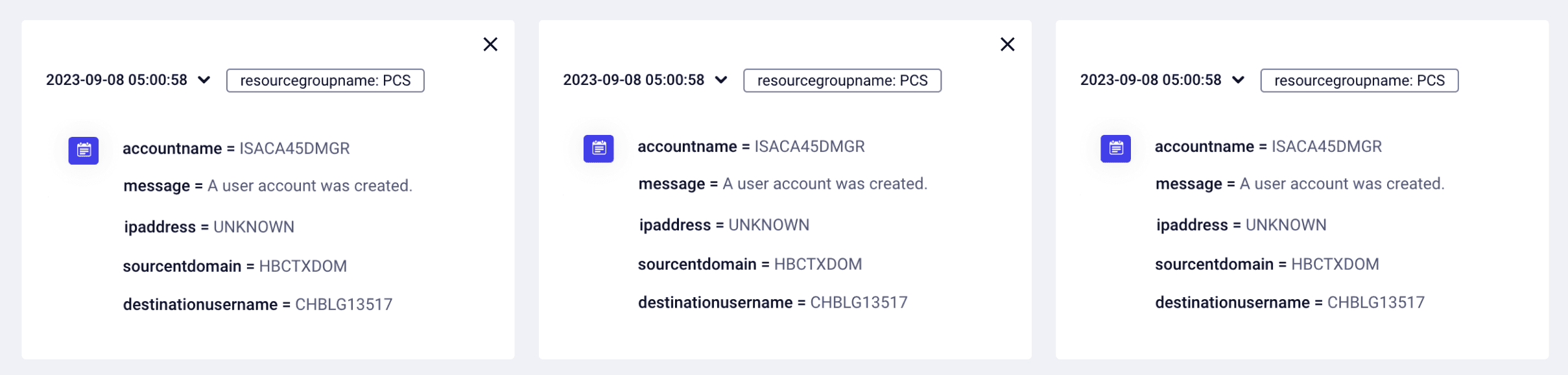
The search query feature in a SIEM platform allows security analysts to sift through large volumes of security data to identify and mitigate potential threats. It enables security teams to tailor their searches and proactively hunt for signs of threats, reducing response time and minimizing damage.
Identifying the core challenges
I knew from previous qualitative research sessions our users where experiencing these challenges:
Slow loading time: The search query system was taking more than five minutes to complete complex queries leaving users in the dark, with no way of knowing the status, increasing frustration resulting in a drop in usage.
Overwhelming complexity: The feature had an excessive amount of poor quality data, which created noise and information paralysis for users, making it harder to make decisions, resulting in increased time on task and frustration.
Validating User Sentiments:
The Role of Analytics
To understand these issues better, I went into the integrated analytics to understand user behavior.
By setting up segments and funnels in our analytics tool, we could understand their journey, identify pain points and less used features, validating our assumptions about user frustration.
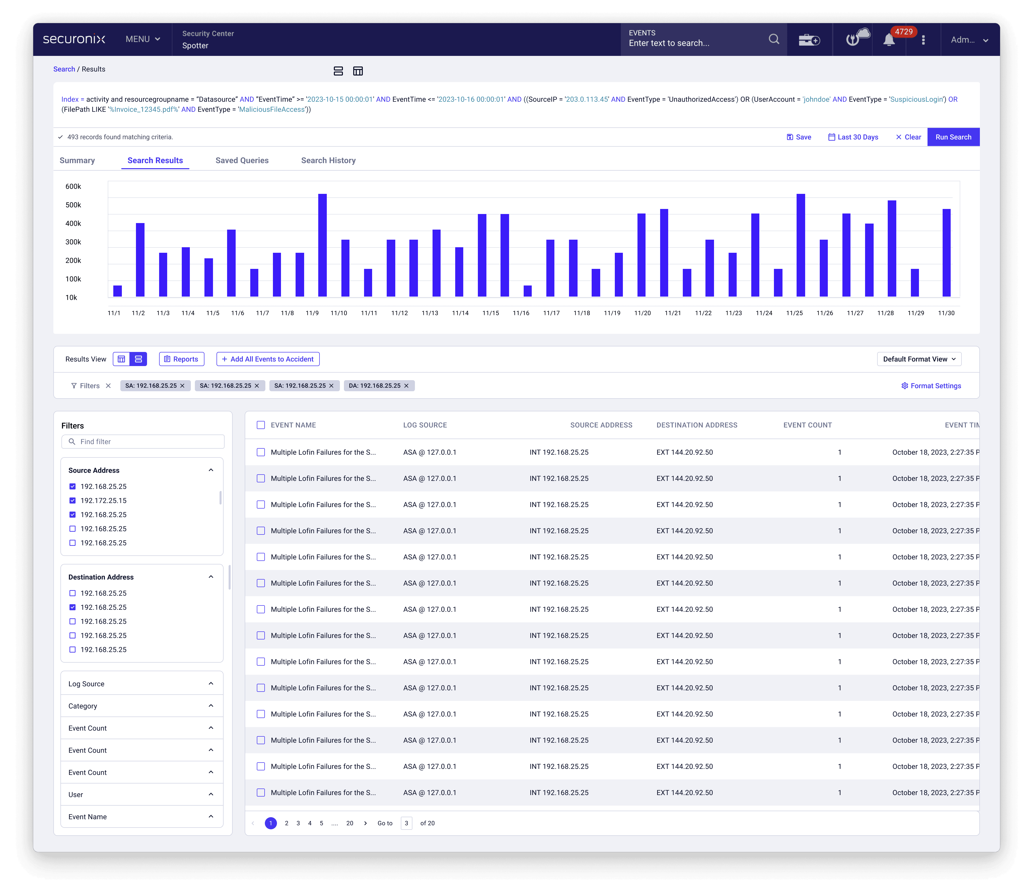
Redesigning the Search Query Page
Guided by analytics and research, I redesigned the search page for enhanced usability, inspired by B2C models and competitive insights. The interface now offers streamlined navigation and quick data access, thanks to new filters, a better layout, and simplified sections. These improvements aim to reduce user frustration, boost conversion rates, and lower bounce rates.
Search loading time
To combat the slow loading times and lack of feedback to provide context I introduce a loading bar and a fast mode. This provided context and set the expectations, and most of all gave users a choice to run queries faster reducing frustration, bounce rate, and encouraging users to make more use of the search.
Before
After
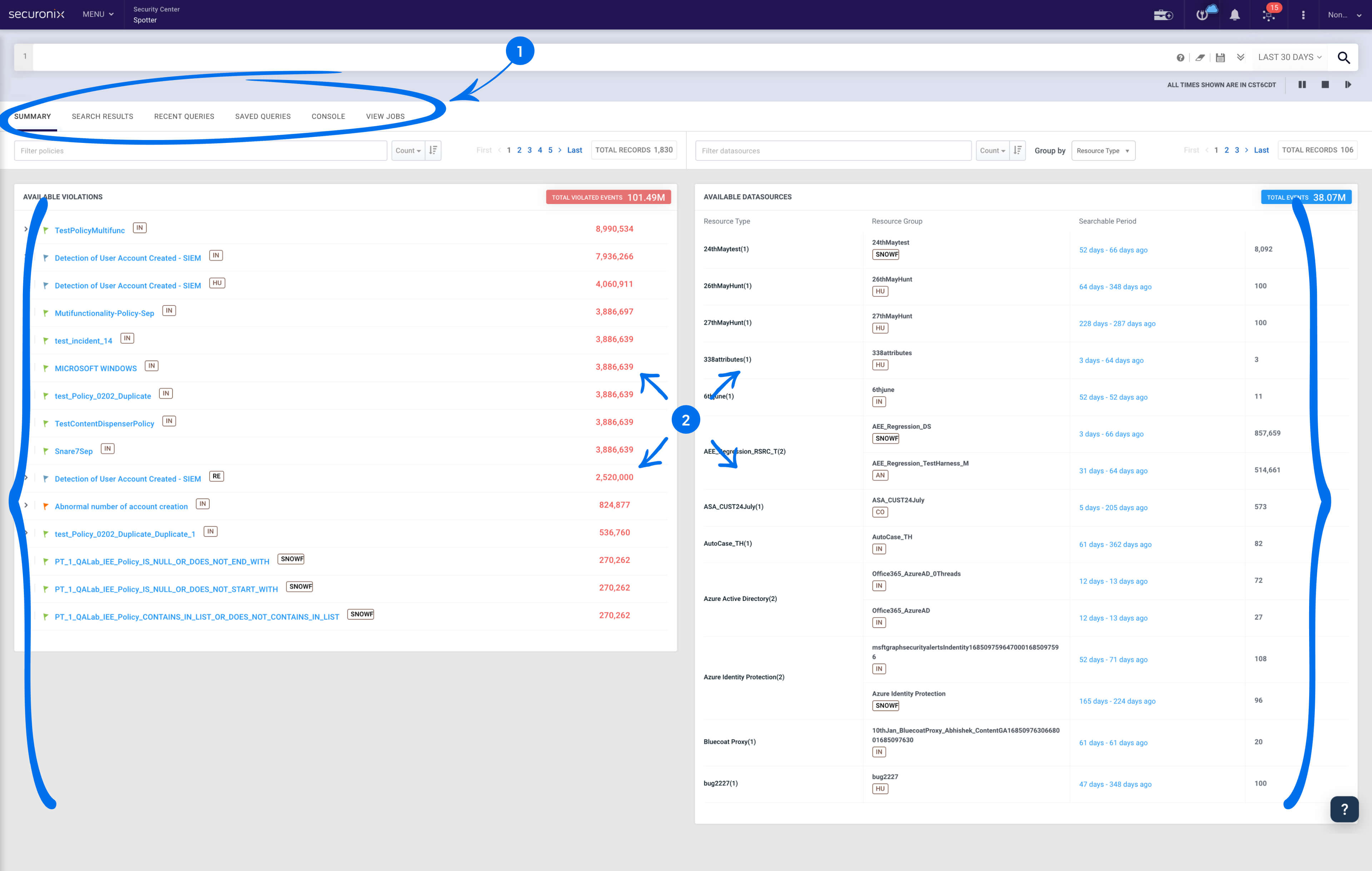
1. Minimum System Status: Took over 5 mins to load, with no feedback during and after the process.
2. High bounce rate: While waiting users would open another tab and forget about it.
Making sense and streamlining the experience
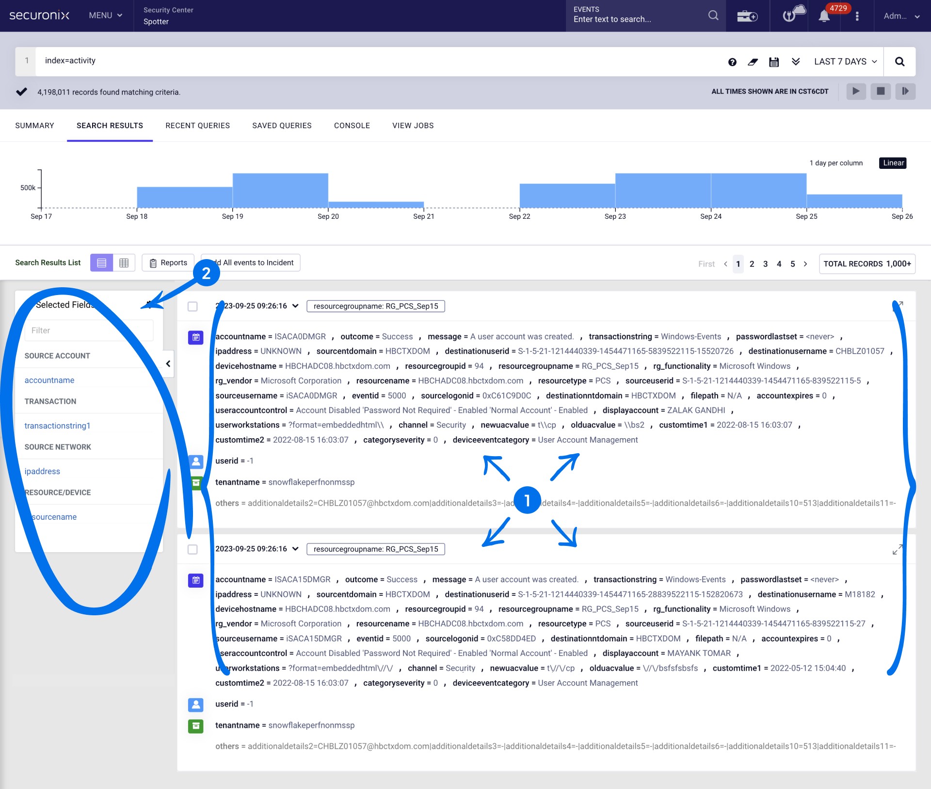
To tackle complexity I improved the navigation's information architecture, move underused features, streamline design elements, prioritizing recent queries, adding personalization features, and incorporating powerful filters. These changes aim to simplify interactions, increase satisfaction, and boost conversion rates.
Before
After


Beyond the Frame
What didn't make it and next steps
While we have made significant strides in enhancing the query speed and user experience, we recognize that there are still areas for further improvement. We aim to reduce the starting barrier by implementing AI to translate simple language to query language as well as a compare feature for a smoother transition between searching for information and taking action. These features started exploration but where deprioritized due to development debt and the deadline.
Search for All
Empowering everyone with AI: The idea is simple but powerful, offer simple language to query translation reducing the entry barrier and helping users understand query language.
Specific query dev complications and a tight deadline pushed this out of scope of v1.

Comparing
Better decisions: Helpful way of comparing for deeper insights and to improve pivoting, saving time.
Exploration was stopped as it was deprioritize for the moment as filters and field customization took priority and could help compare too.
How this exploration lead to reinventing the whole platform as an AI First product.
Impact
By focusing on the core user needs and employing a strategic redesign, it was possible to transform a slow and cumbersome query system into a fast, efficient, and user-friendly platform, thereby elevating the overall user experience and contributing to the business's success.
Improved key business KPIs like Mean Time to Detect (MTTD) and Mean Time to Remediate (MTTR).
" You can't find all the holes in the network, but you can be responsible for the ones you are aware of - This changes makes being aware easier " - Cybersecurity Analyst